How to Design and Create Forms in Microsoft® Access
Last updated on 2024-05-18.
Preface
Developers who are confident in their ability to appreciate the subtleties of RDBMS data modelling, and to engineer the tables and table relationships for the back end of their systems, have contacted me about their lack of experience in designing forms for Access databases.
It's the feedback from people who've been following the Tips on creating a contacts database, party data model, products data model and tables for project management database that's lead me make a start on this article.
Where to Start
Just as considerable thought goes into data modelling the back-end tables, the same must go into planning the front-end UI objects. The back end is what the developer considers it should be; but the front end must be conceived from the viewpoint of the users.
Here are some considerations when re-setting your frame of mind from RDBMS engineer to that of a user-interface designer:
Business Culture
There are things that are unusual, even unique, about how a business operates. Your database needs to sympathetic to these, and operate accordingly.
There are “who-does-what-and-when-under-whose-authority” rules, for example. Corporate style guides. Personal preferences of authoritative decision makers that must be reflected.
Business Process and Work Flow
In my data models, you input an address and then you can assign it to a person or organisation. If you try to persuade database users that they need to input the address first, they'll think you're mad: in the databases they've ever used, you start with a person's, or organisation's, name, and then you proceed to input the address.
They're correct, of course. That's how things are done. It's not up to you to force on them a seemingly illogical way of working.
The Users
If you haven't discussed with the users how they want to use the database, and you've gone ahead on your own with your marvellous creation, then the project is at risk.
If the users don't like your work, then you're stuffed. Don't satisfy the users, and you won't satisfy the boss.
The Hardware
To design forms that make full use of the screen area available, you'll need to know the resolutions of the monitors on which the database app will be displayed.
I avoid Access forms requiring the user to scroll horizontally or vertically. On the other hand, I don't want a form made of closely spaced controls dressed in small fonts in an attempt to cram in information, but which then sends users cross-eyed trying to read it.
The Software
You'll need to know which version of Access to use and possibly whether it's 32 or 64 bit.
General Approach to Form Design in Access
This article charts a personal way of doing things, based on my experience of using using Access since Microsoft made it available to the world. I've changed my approach over the years, but now am settled on one that works for me. Please regard what I say critically if you're to find a way of working that's perfectly suited to you.
I don't use wizards for designing forms. I used to, but I soon learnt that to fit with my view of what a form should look like and perform, I spent more time adjusting what the wizard had created than it took me to design the form from scratch.
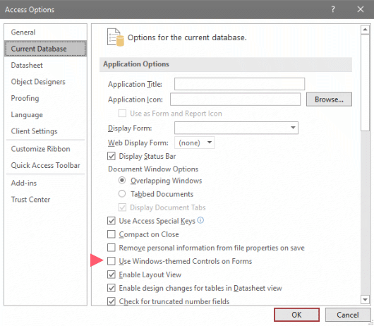
I keep returning to study the utilisation of themes. I've never got on with them. I've never mastered how to prevent them intruding into my designs unexpectedly. So, I continue to keep them at arm's length. As a starting step in suppressing them as much as possible, I turn them off in Access Options:
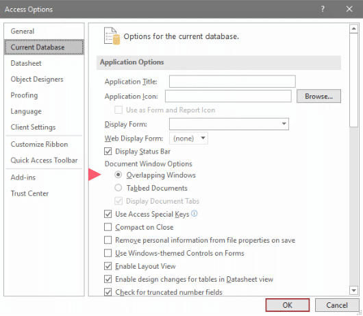
Make your choice between Overlapping Windows and Tabbed Documents:
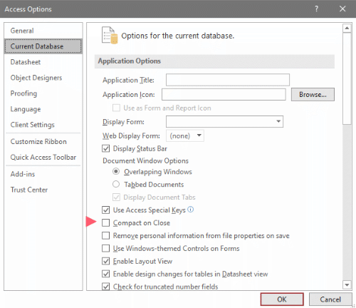
There are mixed views expressed on the web about whether or not to make a front end compact when the user closes it. See Compact and Repair Microsoft Access Database Files for an article on the subject. This is how you set your app up:
A Template for Forms
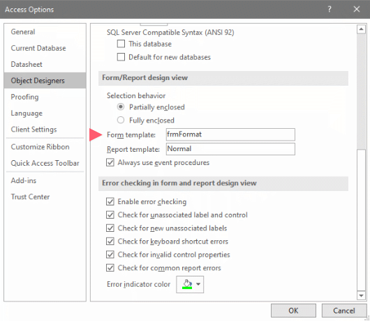
You may use a form in your app to act as a template for the other forms as you create them. I use such a form, naming it frmFormat. You direct Access to use this form in Access Options:
Once the design of a new form is completed, that form is not reliant on frmFormat for its properties. It's new forms only that frmFormat influences. That means you can modify frmFormat at any point in your UI development without it interfering with the forms you've already completed.
Establishing Your Format Form
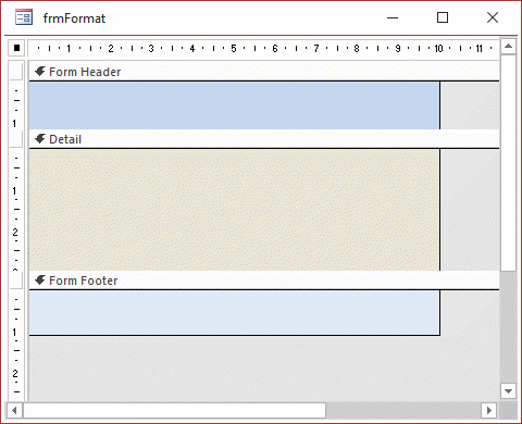
Your aim is to create your frmFormat with properties assigned to it that are crucial to the majority of forms you'll be creating. Here's such a form in Design View:
And here is the same form in Form View:
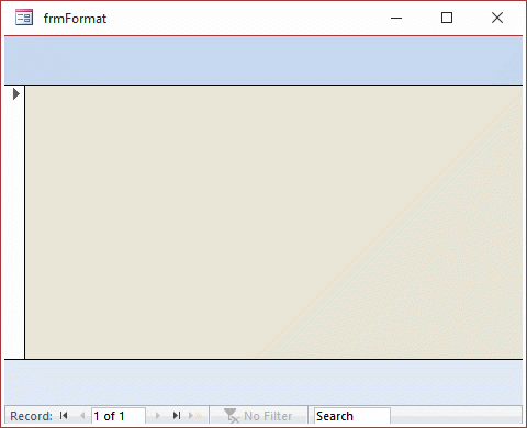
In this initial set-up I've gone no further than alter a handful of properties of the form itself, including:
- A Form Header and a Form Footer
- Background colours for Header, Detail and Footer
- Scroll Bars are set to Neither
There are no control objects placed on any of the sections of the form. The next topic covers templating of form control objects.
Format Form Control Objects
Though you can place controls on frmFormat, don't do that yet. First set the default properties of each of the control objects you want frmFormat to determine. Consider the text box, for example:
- Open frmFormat in Design View
- In the Design tab, in the Controls group, click the Text Box button to display the Property Sheet for the Default Text Box —
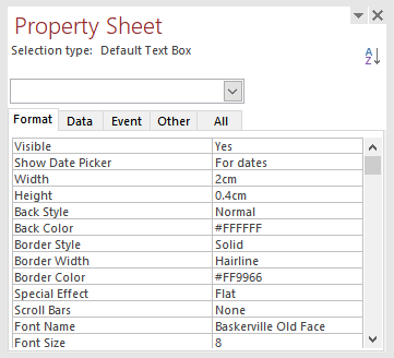
- Adjust any properties to suit your design of subsequent forms.
Now you can place controls on frmFormat to check on their suitability. Any of these that you keep there will not carry through to any new form you design.
aInitialising the Template Form
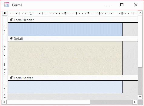
Even though you have saved frmFormat, you need to register it with Access. To do this, close the app and open it. Now, when you create a new form using Form Design, frmFormat delivers:
General Appearance of Forms
Colour If you sit six people in a room and ask them what colours they would like for their database, I bet you'll not get agreement. When colour came to the personal computer, there were about 250 to choose between. Developers went wild with UIs in combinations of primary colours. Today there are over 16 million colours you can use from. With that choice where do you start?
My answer is start with a palette of greys for your prototype. For touches of glamour (that means here and there only), pick colours that reflect your client's use of colour in their business. Take a lead from their logo, for example.
This approach will be considerate towards users with colour vision deficiency. The NHS reports that one in 200 women and one in 12 men have “red-green” deficiency. So, we developers are going to have users who find it hard to tell the difference between reds, oranges, yellows, browns and greens; have trouble distinguishing between shades of purple; or can confuse reds with black.
Special effects What to do with shadow, fade, raised, sunken, etc. I say: do nothing. Reflecting on my application of them, I see that they probably added nothing to users' experiences of their databases.
We can learn from the changes in fashions in interface design, from those of 15 or so years ago —

To those prevailing today —

Fonts For reading off a computer screen it's widely agreed that a sans-serif font is better than a serif one. That opinion may change as monitors improve pixel density, but for the time being, I recommend design using a sans-serif front for Access forms. Since its introduction with Windows 95 Tahoma has been a go-to typeface for the screen.
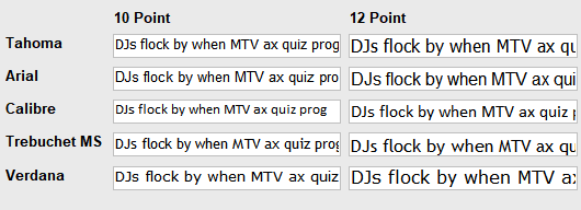
Since its introduction, together with Verdana in Windows 95, Tahoma has been a go-to typeface for the screen.
Arial is used widely. Calibre is familiar to users now because of its wide use in Microsoft Office as the default font.
I recommend that you don't use Arial Narrow. Users find it squintingly difficult. Furthermore, its use is often an indicator that the form design is poor, because the designer is the guilty of the sin of control and information cramming.
You could try out a form with a mix of type faces. This can give you a test of monitor capabilities and user preferences. Then you could incorporate your findings into your frmFormat.
Font Size Closely allied to the choice of typeface, font size is crucial to providing legibility to the information displayed on screen. Avoid the temptation of applying a small point size in pursuit of cramming information into any area of the screen. In my experience, on release of the prototype app invariably the request for “more space for this and that” is received.
Control Spacing Placing information-bearing controls, e.g. text boxes and combo boxes, and their labels, too close together can make legibility become an issue amongst users.
On the other extreme, controls displaying related data, and placed too far apart, can lead to wearisome eye movements.
Application of the Size/Space feature from Sizing & Ordering on the ribbon's Arrange tab makes experimentation with positioning quick to complete. For example, select the controls:

From the Sizing & Ordering drop-down menu, select Increase Vertical:

Prototyping
The experience gained from creating hundreds of databases has lead me to always use a prototype to present a proof of concept. The prototype is issued to a panel, the membership of which I try to influence to include key users and the person who I hope might become the client's “Database Champion”.
The Dashboard First impressions count, so the prototype always has that opening screen to provide for easy navigation through the application.
A popular type of dashboard is one made up of buttons. A down sides to this type is that there may not be isn't enough screen area to accommodate all the buttons, so the developer includes buttons to open more screens with more buttons. I don't like to oblige users to mine screens in order to get to where they want to start work.
Another down side to the use of buttons is that if you need to include another one, then the form needs re-designing.
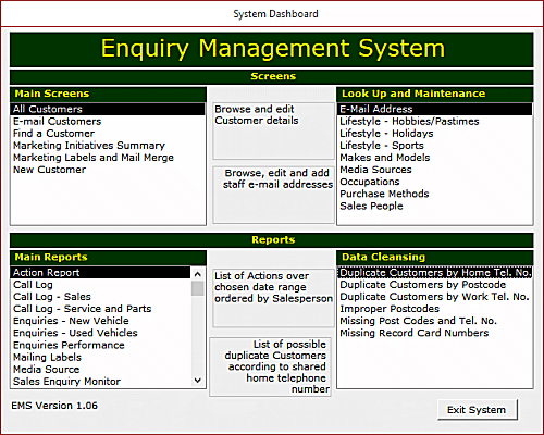
As an alternative to buttons, I resorted to lists, as in this example from about 15 years ago (I know! I know! It looks its age. But that's not the point. It's the principle that counts):
And here's an example from a recent prototype (explained in full on How to Create an Access Database Dashboard or Switchboard):
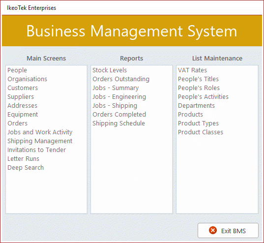
A double-click on any of the listed items opens the appropriate form or report. The dashboard form itself doesn't need any design changes when, say, a new report is to be added. All the developer does is add a record of the report to the look-up table that's the row source of the Reports list.
Once you've created such a dashboard, you can import it into other databases and use it there with very little re-design. Change the text in a couple of labels, alter a couple of colours and away you go.
Forms and Subforms
One way to create a form that displays information from tables that are in one-to-many relationships is to have a main form and a subform. The main form has as its record sources the table that's on the one side or the relationship.
The subform is a form in its own right, but is introduced as a control object in the design of the main form. In this example the main form contains the invoice number and date, the customer and their address and order number.
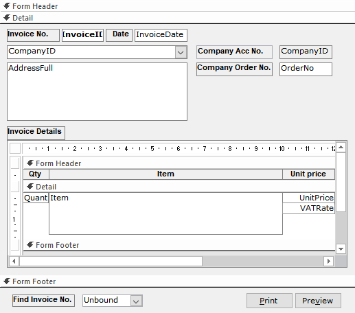
The subform contains the quantity and unit price of each item charged to the customer under this invoice.
For a main form to contain a number of subforms, you cloud consider the use of a tab control rather than cramming all the sunforms onto the same screen. This could be a blueprint for a form for products:
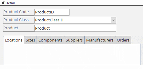
Each tab is intended to contain a subform. The subform on the Locations tab will list the many stores around the country in which and held stocks of the particular item appearing on the main form.
Any Ideas?
If you have any ideas on what I could add to this article to make it more useful, then please let me know.
Your Support for DMW TIPS
Please support this website by making a donation to help keep it free of advertising and to help towards cost of time spent adding new content.
To make a contribution by PayPal in GBP (£ sterling) —
To make a contribution by PayPal in USD ($ US) —
